
Building in the AI era
How to build a tasteful AI company
Updated October 2026 · 18 min read
AI made software cheap to make. It did not make it good. A working dashboard now takes an afternoon, which means a working dashboard is worth about an afternoon. The products people keep are the ones where someone decided what to leave out, what to say, and how it should feel in the hand. That is taste, and it does not come from a prompt. This guide is how a small team builds a company around it.
What taste is, in a product
Taste is judgment made visible. In a product it shows up as four things, in this order.
- What is not there. The feature that was cut, the setting that was never added, the second button that would have hedged the first. A tasteful product is smaller than its competitors and feels larger, because every part of it was chosen.
- What it says. Plain sentences in a consistent voice. It says what happened and what to do, and never claims more than it knows. The copy is written by the same hand that designed the screen, so the words and the layout agree.
- How it feels. One typeface, a small type scale, one accent colour, consistent corners, and motion that only moves when it tells you something. These are not decoration. They are how the product shows it knows what it is doing.
- How it behaves when it is wrong. Empty states, errors, a 404, a slow query. Tasteful products treat these as pages someone will read, not edge cases nobody will hit.
Taste is not minimalism. A minimal product can be bare. A tasteful one has exactly what it needs, finished.
It is also not style. Style is the surface a company chooses; taste is the judgment underneath it. Two companies can share a style and differ completely in taste, and the test is what happens when a customer asks for something that would make the product worse. The stylish company adds it with a toggle. The tasteful one says no, and says why.
Why taste is now the moat
Three things used to protect a software company: the code was hard to write, the data was hard to collect, and distribution was hard to earn. Models have made the first one close to free, and are eating the second. What remains is the third, and distribution now follows the product people talk about, which is the one that feels made.
There is also a quieter reason. When a model generates an interface, it generates the average of every interface it has seen. Average is the one thing a small company cannot sell. Taste is the deliberate departure from the average, and it is the part of the work a model cannot do for you, because it requires knowing which of ten correct answers is the right one for this product, these users, this moment.
The companies that get called tasteful, Apple, Linear, Stripe, Anthropic, Cursor, Vercel, teenage engineering, are not alike in style. They are alike in judgment. Each one is willing to leave out something customers asked for, because adding it would make the product worse.
The test: would you remove it?
Here is the fastest way to tell whether a team has taste. Ask what they removed last quarter. A team without taste can only list what it added. A team with taste has a list of things it took out, and a reason for each: a chart nobody read, a setting that let people hurt themselves, a second call to action that halved clicks on the first.
Removal is the hard half of the work because every feature has a sponsor. Someone asked for it, someone built it, someone's dashboard counts its usage. Taking it out costs a conversation. Leaving it in costs nothing today and everything over time, because the product slowly becomes the average of every request it ever received.
The principles, as they are practised
One typeface. Linear uses Inter everywhere. Anthropic cut its own. Cursor uses the system face. None of them mixes a display face with a body face. One voice for the product, the site and the emails.
Weight, not size, carries hierarchy. Open the Claude desktop app or Cursor's settings: headings are the same size as body text, set medium instead of regular. Nothing is bold. Size is reserved for one title a screen.
One accent, and it means something. In Linear the accent is the selection. In Clerion the blue marks what the AI wrote and what you can press. If the accent is used for decoration, it stops meaning anything.
Surfaces are the ink at a fixed share. A card is the text colour at four percent over the page. A hairline is eight. Hover is six. When every neutral is a share of one colour, light and dark mode are the same design, and nothing ever clashes.
Motion is spent, not sprinkled. Cursor's stylesheet has 170 transitions on opacity and 20 on transform. Things fade and tint; they move only when they change place. Attention is spent once: a found setting pulses for a second and a half, then the interface is still.
Say the conclusion. A dashboard shows numbers and leaves the reading to you. A tasteful product reads them and says the one thing worth doing, then shows the numbers as evidence. Writing the conclusion is harder than drawing the chart, which is why most products draw the chart.
Finish the edges. The 404, the empty inbox, the first screen after signup, the email that says your card failed. These are where most products stop caring, and where users decide whether the company does.
Ask for one thing at a time. A signup form with five fields is five chances to leave. Every extra field, step or decision at the start costs real customers, and the cost compounds because the people who leave are the ones who had the least patience and the most options. Ask for the one thing you need, then earn the next.
Let the product be quiet. No badge counts, no confetti, no toast that arrives to say a thing happened that you watched happen. A product that is confident does not announce itself. Notifications are for things the user did not see and needs to.
Clerion as the worked example
Clerion is website intelligence for AI founders: one script tag, and each morning it reads your site the way a sharp analyst would and says the one thing worth doing. It is also a company built on the principles above, so here is how each of them became a decision.
The product says the conclusion. The dashboard opens on a sentence, not a chart. "Signups fell by a third this week, and the cause is the pricing page, which started taking four seconds to load after Tuesday's deploy." The numbers sit under it as evidence, one click away. Writing that sentence is the whole product; the charts are what every other tool already had. Every figure in the sentence comes from the data, never from the model, and when the data cannot support a claim the sentence says so.
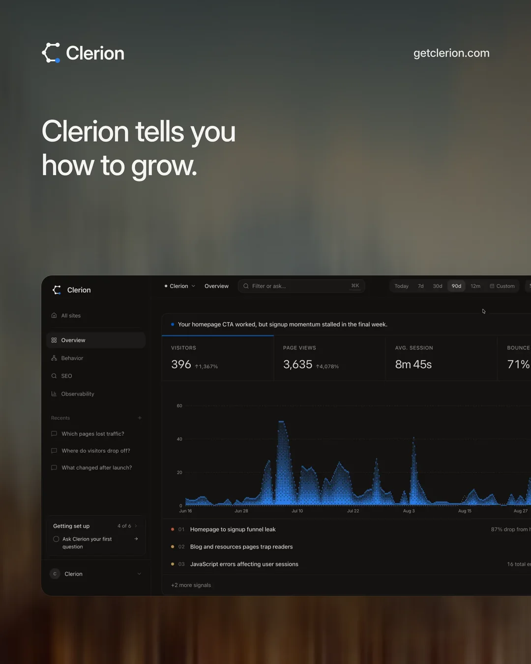
What was removed. Clerion does not do session replay, retention cohorts, feature flags or a Stripe dashboard. Each was asked for. Each would have made it a product-analytics suite, which PostHog and Amplitude already are, and would have buried the sentence under a tab bar. The list of what it is not is published on the What is Clerion page, so the decision is made once and in public.
One typeface, one accent, medium at most. The product, the site, the emails and the briefings are all set in Inter. Nothing is bolder than medium; hierarchy comes from size and colour. Science Blue is used for two things only, what the AI wrote and what you can press, so a reader learns in a minute what blue means. Every surface, hairline and tier of text is a fixed share of one ink, which is why the light and dark themes are one design and not two.
Motion that tells you something. A new finding slides in once and pulses once. A copied snippet changes the button's label to "Copied" and nothing else moves. Hover is a wash, not a lift. The rule, borrowed from reading Cursor's own stylesheet, is that opacity and colour are the motion, and transform is reserved for things that actually change place.
The edges are finished. On the 404 page the mark's points sink back and land again, centre outward, while it looks for the page. The install step is one sentence, the snippet with its copy button, and everything optional hidden until it applies. The footer ends on a row of Amsterdam canal houses in points, because that is where the servers are, and a small line that says so. None of these needed to exist. All of them are the product.
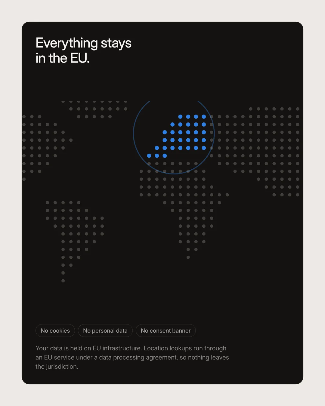
Privacy by construction, said plainly. No cookies, no fingerprinting, IP addresses discarded after the location lookup, everything held in the EU, and the model only ever sees aggregates. Not a policy page: the way the system is built, and written in a sentence a founder can repeat to a customer.
One ask at a time. Signup is an email. Setup is a domain, then one script tag. The trial needs no card. Each step was cut to a single field because each extra field, measured, cost signups.
The rules are public. The brand page lists the typeface, the weights, the ink shares, the corner radii, the motion timings and the voice, and says that when the site and the product disagree, the product is right. The same page says what Clerion believes about taste, so a customer can hold the company to it.
The point of the example is not that Clerion is finished. It is that every one of these was a decision someone could have skipped, and a tasteful company is the sum of the ones it did not skip.
How a small team does it
A tasteful company is not a company with a big design team. It is a company where the person who decides what to build also decides how it reads and looks, and holds all three to one standard. Here is the working method.
Write the rules down, once. A brand page that says what the typeface is, what the weights are, what the accent is for, how corners and motion work, and what the voice sounds like. Clerion's is at getclerion.com/brand. Everything the company makes is checked against it, including this guide.
Study the companies you admire by reading their work, not their marketing. Cursor's and Claude's stylesheets ship inside the apps. Read them. Count the transitions, read the token names, measure the type scale. What they actually do is more instructive than what anyone says about them.
Decide what you will not build. A written list. Clerion's says: not session replay, not retention cohorts, not feature flags. Every feature request is checked against it first. Saying no is most of taste.
Make the product say the conclusion. If your product shows data, make it write the sentence a good analyst would write about that data, and put the sentence first. This is the single largest difference between a tool people check and a tool people trust.
Review the words with the screens. Copy is not written after design. It is design. The person who approves a screen approves the sentence on it, and both are held to the same voice.
Sweep the edges every release. Open the empty states, trigger the errors, visit a wrong URL, read every email the product sends. Fix what reads as an afterthought.
Ship less, finished. A release with three finished things beats one with ten half-done. Users remember the one rough edge, not the nine smooth ones.
Mistakes that look like taste
Minimal, but empty. A sparse interface that leaves the user guessing is not restrained, it is unfinished. Restraint removes what does not help; it does not remove the help.
Consistent, but dead. A design system applied so rigidly that every screen is the same screen. Consistency is a floor. Judgment is knowing which screen earns an exception, and why.
Opinionated, but unexplained. Saying no to a request without saying why. The no is taste; the why is what lets a customer trust it. Publish the reasoning.
Polished, but late. Spending a month on the motion of a feature that should have shipped in a week. Taste includes knowing what deserves the time. A quiet, finished, modest feature beats a lavish one that arrives after the moment passed.
The Clerion brand in full
Everything above is principle. This is what it produced: the brand Clerion uses, written down as it is used. The showreel is at getclerion.com/brand.
The story
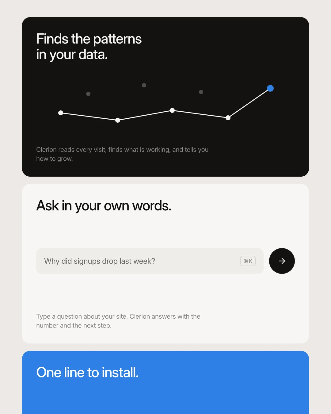
A website says something to its owner every day. Who came, from where, what they read, where they left, what broke, what Google and ChatGPT could see. It arrives as thousands of points, and almost nobody reads it, because reading points is an analyst's job and most founders do not have one.
Clerion is the reader. Each morning it looks at the points the way a sharp analyst would, sees the shape they make together, and says the one thing worth doing in a sentence. Everything in the brand is that one gesture: many points, placed by one rule, until they form a shape you can read.
The name is from the Latin clarus, clear. The product makes the week clear. The mark is that gesture, drawn. The colours are paper and ink, with one blue for what Clerion found. The voice says what happened and what to do, in plain sentences, and never more than the data supports. The heron stands still and watches, and moves once, when it matters.
The mark
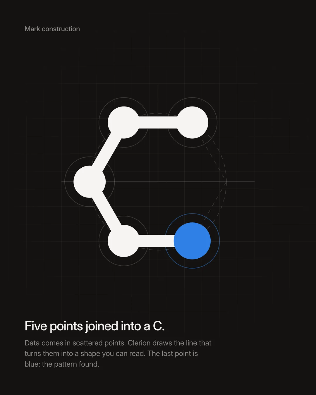

The mark is called Seed. It is a little over a hundred points, each turned 137.5 degrees from the one before, the angle a sunflower lays down its seeds by. That single rule packs them with no gaps and no two in the same place, and the points grow as they move outward, the way a week of visits builds into something you can see. The right side is left open, so the points read as a C, open toward what comes next.
It is one colour on every ground: off-white on dark, near-black on light. Blue stays out of the mark, so that in the product it keeps meaning one thing. Below 64 pixels the mark is drawn again with 32 larger points, so it is still a C in a browser tab. The SVGs and the full kit are at getclerion.com/brand/clerion-brand-kit.zip.
The colours
| Colour | Hex | Use |
|---|---|---|
| Near-black | #110F0E | Page and product ground |
| Off-white | #F2F0EE | Type and the mark on dark |
| Blue | #2E80E6 | What the AI wrote, links, what you can press |
Paper and ink, and one blue. The near-black is the page at night, the off-white is the ink that reads on it, and the blue appears only where the finding is: on what the AI wrote and on what you can press. The mark itself stays ink. Three colours, and nothing else, so that the blue always means the same thing.

How we design
| Rule | What it means |
|---|---|
| Typeface | Inter, and only Inter. One voice for the site, the app and the emails. |
| Weight | Regular for everything, medium for emphasis, nothing bolder. Size and colour carry the hierarchy. |
| Ink | One warm ink per theme. Every surface, hairline and tier of text is a fixed share of it: 4, 8, 14 and 20 percent for surfaces, 84, 74 and 60 for text. |
| Light | Paper on an ivory page. A card is a step lighter than what it sits on, lifted by a soft shadow, never a border. |
| Accent | Science Blue, #0066CC, for what the AI wrote and what you can press. Colour never sells. It only warns, in bronze and terracotta. |
| Corners | 16px on cards, 10px inside them, pills fully round. |
| Motion | Fades and tints, not slides. 100ms for colour, 200ms for state, 300ms for arrivals, on one soft curve. Attention is spent once, then the interface is still. |
| Words | Plain English conclusions, in quiet confidence. Say what happened and what to do. No em dashes, no exclamation marks, no claim the data cannot carry. |
The same rules build the product, the site and the emails. When one of them disagrees with the product, the product is right.
Fen, the heron



The story has a character. A heron stands still all day, watches the water, and moves once, when it matters. Clerion reads your data the same way and hands you the one fix. Fen is that idea, with feathers.
- Three moods, no others: neutral (always), side eye (saw your bounce rate), asleep (waiting for data).
- He peeks up from the bottom edge. He is never shown full body.
- He never speaks, smiles, points or holds the logo.
- Near-black line, off-white body, blue beak. Don't recolour him, redraw him, add props or put him in costume.
Carousels
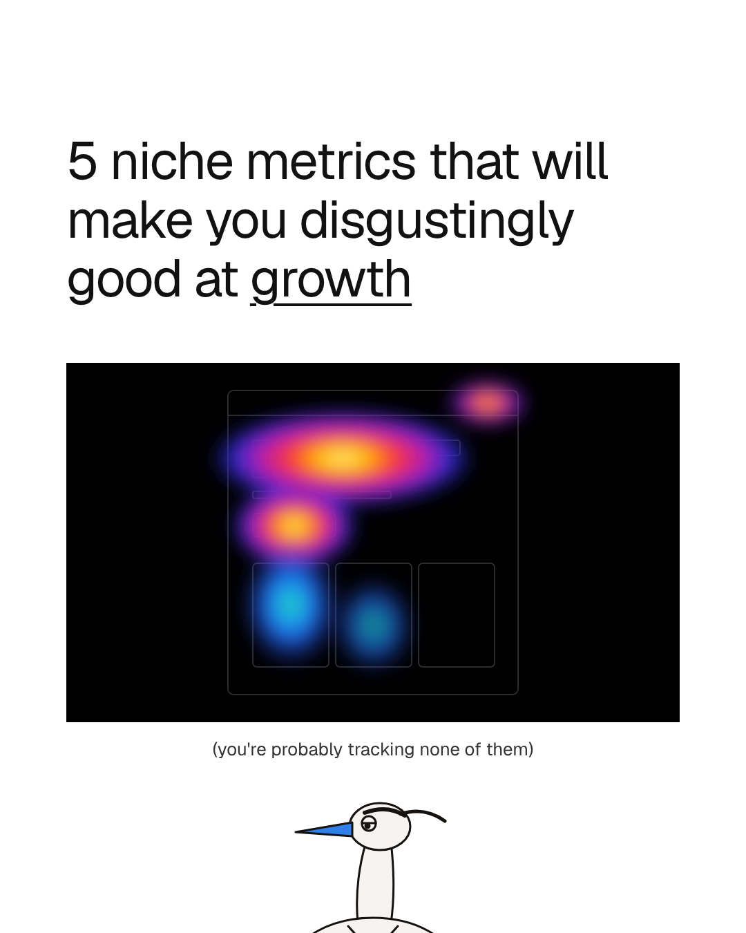

One idea per slide, written in lowercase. No logo, no product and no call to action. The account sells by being useful, not by asking. Slides are 1080 by 1350 on white, in Geist 400 near-black: a 76px title, a 36px body of two sentences at most, a 26px line in brackets, 96px margins. The cover carries a title, one image, a line in brackets and Fen underneath; an inner slide carries a title, two sentences and one square image on the right. White and the image colours are the only things outside the three brand colours, and only in carousels.
Using the name
Clerion, not Clerion AI or Clerion Analytics. It is often confused with Celerion and Clarion, which are unrelated companies.
What it costs, and what it earns
Taste costs time at the start, because every decision is made on purpose, and it costs features, because many are declined. It earns a product people describe to each other in a sentence, a brand that does not need an ad budget, and a team that can tell good from bad without a meeting. For a company competing with tools that were generated in an afternoon, that is the whole difference.
Clerion is built this way: one typeface, one accent, nothing bolder than medium, and a reading of your website each morning that says the one thing worth doing. The full brand is written out above, the showreel is at getclerion.com/brand, and the founders' note is at getclerion.com/about.
Frequently asked questions
Is taste the same as good UX?
No. Good UX is a floor: the product is usable, consistent and accessible. Taste is above the floor: of the many usable designs, this one was chosen, and the choice shows. A product can have excellent UX and no taste. It cannot have taste and poor UX.
Can a technical founder without a design background build a tasteful product?
Yes, and most tasteful products were. Taste is judgment, and judgment is built by looking at good work closely and deciding what you believe. Read the stylesheets of products you admire, write your rules down, and apply them without exception. A designer helps; a point of view is the requirement.
Does taste matter for a developer tool or a B2B product?
More, not less. Developers and operators spend their day inside the tool, and they notice every rough edge. Linear, Cursor, Stripe and Vercel are all developer or business tools, and taste is the reason each is named ahead of its competitors.
Will AI-generated interfaces catch up?
They will get more polished, and polish is not taste. A model produces the average of what it has seen. Taste is the deliberate departure from that average for a specific product and audience, and it needs someone who knows what the product is for. That part stays human.
Is taste expensive?
It costs decisions, not money. The expensive parts of tasteful products, a rule written down, a feature declined, an edge case finished, are time rather than headcount. Clerion is self-funded and small. What it does not spend on features it did not build, it spends on the ones it did.
How do you measure taste?
Indirectly. The signals are word of mouth as a share of signups, how often users describe the product in a sentence rather than a feature list, support tickets that start with thank you, and retention that does not need a re-engagement campaign. If you have to run ads to explain the product, taste has not done its job yet.